Time: 3-week design sprint, January 2021
Tools: Figma, Illustrator, Trello
Roles:
Shannon: Design Lead
Julia Delmedico: Designer
Smith Robertson : Research Lead
Helene Oliveira: Researcher
I was responsible for building a strong, user-centered design that satisfied U Scope's business requirements. I used creative and technical problem-solving skills to guide the team's UX strategy and execution.
Photo ID is an app designed to provide a rapid and organized system of capturing and labeling commercial and residential property inspection images to generate a photo report with ease before leaving the inspection site.
U Scope wanted the app's UI to be more user-friendly and intuitive by developing a design solution inspired by popular social networking apps like Instagram or SnapChat. The end goal was increasing the speed of use and reducing the cost of onboarding/training new users.

Our team took an iterative approach in our design process. We broke it down into three phase. First, we sought to better understand U Scope's vision and compare it to insights gained from interviews with app users. Through these interviews we were able to generate an idea of who the user is and the root of the pain points they were experiencing. We then went through several rounds of design, testing and iterating to reach the final product.


Property Pete is a 37-year-old property inspector that has been working in this business for more than a decade. Pete has been using Photo ID for a couple of years and thinks it is the best app available for property inspections. When he is taking photos, Pete takes full advantage of the voice recording and sharable link.
" I need a faster and more efficient way to create and submit my photo reports."
We made a user journey of Pete's process using Photo ID and creating a photo report. Pete encounters the most severe pain points when he is taking photos at the site and then sharing the photo report at the end of the day. To improve this, we simplified the camera, reduced the amount of icons and created a tool bar, as well as giving the user the option to edit photo reports after they are generated.

Once we sorted out all the features, we created a navigation scheme to organize the features by page and show the general layout of the application.


We began our ideation process by doing a color design studio and sketching out different layout options and interaction patterns for the main functionalities of each page.

Our main focus was simplifying the design and bringing more of a community feel to the application. After an initial round of user interviews with 3 professionals in the property inspection business and 3 non-industry professionals, we made 3 key changes:
1. We initially added a messaging system to the application but received feedback that users are more likely to text or make calls.
2. A trending videos section was added to the homepage, for users to sort through relevant videos about their industry, but it did not give much benefit to the user or make his inspection more efficient.
3. Lastly, we had our camera tool bar in a drop down menu. But users had a difficult time finding that, so for our next round of designs we added it at the bottom.
Because our client recently spent a lot of time and effort making a tutorial video series, we wanted to honor as much of the original design as possible. We kept a lot of the same features and concepts but put most of our energy into making the design more simple and clean. Because Photo ID has a large age range of users, we wanted to make sure it was accessible and user friendly.
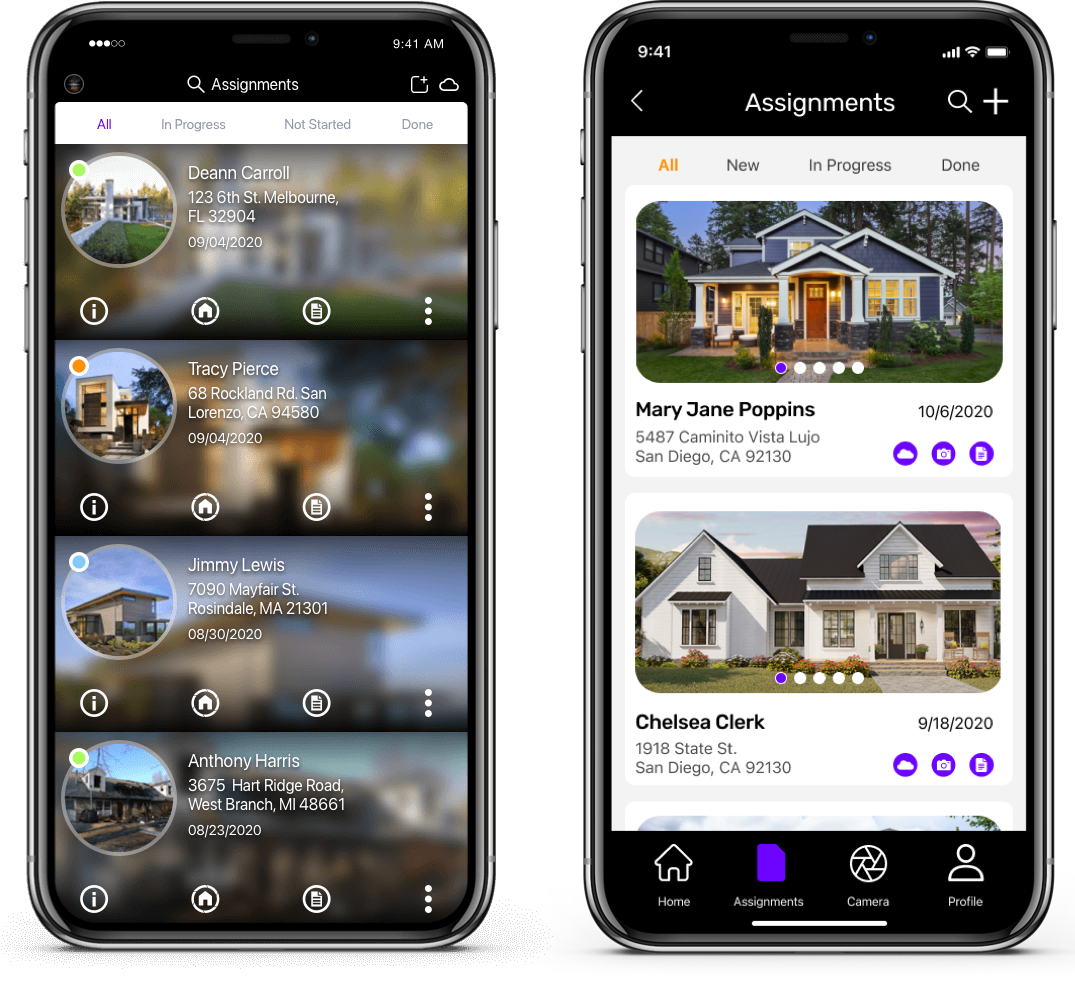
Users told us they were overwhelmed by the overlapping photos and icon placement in the original app design (left). We fixed this by giving each assignment its own block, incorporating a photo carousel and picking more initiative icons (right).
The app's camera is where users experienced the most pain points in the entire application. The photo options were spread all over the page with no particular organization. We introduced a more organized tool bar at the bottom and a drop down menu so it would be easier to change rooms.


The information and features were cramped together on this page. So we gave everything breathing room and put the most important functions for generating a photo report, at the top. We also replaced the home icon in the top left with a proper back arrow because the original icon was confusing users.

We wanted the homepage to be specific to the user. We accomplished this by putting in a schedule section, where users can see their tasks for the day and the route they are goign to take (with driving time included). We also included the user's more recent assignments and collaborators.

To satisfy the users desire for a "social media feel" we implemented a messaging and notification system. When a coworker makes a comment on a report or photo, the user is notified and can send a return message.

The original onboarding system was 45 pages long. Many users admitted that they skipped the onboarding and just learned the app themselves. We changed the onboarding to make it more interactive and broke it into sections so the users actually does the task while learning.
We created high-fidelity mockup and prototype with UI specifications documentation explaining each UI element and interaction pattern for our client and his developers to better understand our design decisions.

We left our client with several suggestions for the future. The first being the app's name. We got feedback from users that the name "Photo ID" does not correlate with the services the app provides. When you search for property inspection apps, Photo ID is always on the bottom of the list. We suggested changing the name to create better recognition and easier way to market the app.
One feature our group was very excited about was using AI recognition to tag specific parts of the structure when taking photos. Although we did include our version of that design feature, we were not able to test and iterate.


.svg)